Lab 8 looked at ArcGIS and showed how it is used with imagery to collect data in real life situations. ArcGIS is a software used to look at geographical data. It has options to change the color spectrum which can show the same photo in different ways. This makes it easy to analyze the data through multiple lenses which can bring out information that could not be seen with regular photos.
Methods
A field team was doing controlled burns and using UAS to take photos with multiple sensors as they did the burns. They collected data before and after the burn. These pre and post-burn photos were then provided to the class to be analyzed.
 |
| Preburn RGB: 3, 2, 1 |
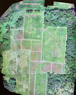
This is the first version of the preburn photo. The RGB settings were changed to 3, 2, and 1 to give a true color photo. Shadows can be seen along the tree line. There are also walking paths around the squares in the field.
 |
| Post-burn RGB: 3, 2, 1 |
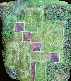
After the controlled burn was completed, this photo was taken. The squares are now purple/brown. Also the shadows that were seen in the preburn photo are now gone. This means that the sun is likely overhead in this photo where it was still coming up in the preburn photo. These are examples of the information that can be found in these photos. Because the RGB settings in these photos show a true to life color, the data that can be collected is somewhat limited.
 |
| Preburn RGB: 5, 3, 2 |
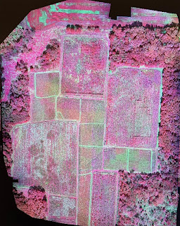
By changing the RGB settings to 5, 3, and 2, the green areas of vegetation become pink. The dead areas where no vegetation exists become white and green. This can make it easier to see how the burn effected the vegetation.
 |
| Post-burn RGB: 5, 3, 2 |
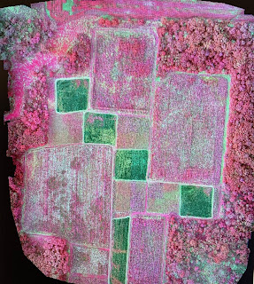
By looking at the burn areas with these RGB settings, areas where the burn did not have as much impact can be seen. In the second square from the left a small patch of pink coloring can be seen. The fire may have not reached this area or stalled out here. This detail is in the first set of photos but with different settings, details can be pulled out more easily which highlights areas of focus.
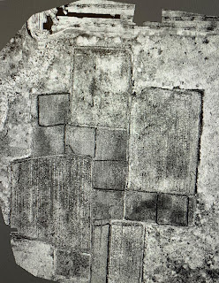 |
| Preburn NDVI 1 |
NDVI is a normalized difference vegetation index. NDVI images show stress on vegetation and highlight areas where there is no live vegetation. In this preburn photo, the walking paths are completely black. This makes sense as there is no vegetation in these areas.
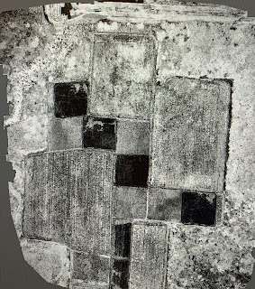 |
| Post-burn NDVI 1 |
The post-burn NDVI image really shows how useful it can be. The burn areas are highlighted in a way that shows the effectiveness of the controlled burn. Another use for this type of imaging could be with farmers. Looking at the fields where there were not any burns, farmers could see how well their crops are growing. The top rectangle shows some signs of black in the middle area. This means vegetation is not growing well here.
 |
| Preburn NDVI 2 |
The settings for the NDVI image were changed to a green to orange gradient. This setting was chosen because it highlights all the differences in vegetation fairly well. The first NDVI photo seemed to be mostly grey and black. This could make it more difficult to see detail while the green to orange gradient provides enough contrast to analyze the photo.
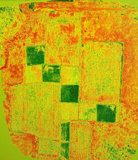 |
| Post-burn NDVI 2 |
Compared to the other post-burn photos, this one has the most contrast. Orange areas highlight dense vegetation and green areas highlight no vegetation.
Discussion
ArcGIS has many uses for people analyzing geographical data. This could be useful for farmers where they can see what areas are not growing and need more care. It is also useful for seeing how things like natural disasters affect vegetation. Although it is useful for analyzing data, changing the color schemes can lead to problems. In the last NDVI photo, areas with no vegetation are green. False coloring can confuse people if they are not told what the colors represent. Another problem is not all false color schemes are useful. As you look at the first NDVI photos you can see that the images are on a grey scale. This can make details mix together and be difficult to analyze.
Conclusion
While there are some drawbacks to false coloring, nothing is perfect. Each setting has its positives and negatives. Using these different color settings helps with analysis and presentation as you can play with the settings until the areas you want to show stick out around the other areas. ArcGIS was difficult to navigate at first, but with a little bit of knowledge it is makes data analysis easy.


Comments
Post a Comment